Examples of using CSS variables
Proper use of them allows you to significantly reduce the time and labor costs for solving certain tasks in CSS. On the eve of the start of the new stream of the Frontend development course, we are sharing with you a description of the practical use of CSS variables in addition to their use for creating design markers, such as colors.
What is the main problem?
If you use CSS variables in the same way as CSS preprocessors (for example, in Sass), then you do not fully realize all their advantages. Consider the following example:
:root {
    --brand-primary: #7777e9;
    --brand-secondary: #c96fde;
}

.title {
    color: var(--brand-primary);
}
And there is no difference with the example below in Sass:
$brand-primary: #7777e9;
$brand-secondary: #c96fde;

.title {
    color: $brand-primary;
}
Using CSS variables as color variables is by no means an error. But it’s like buying an Apple MacBook M1 to visit Internet sites, although your old desktop PC, assembled in 2012, does it well enough. What is the point of buying an ultra-modern computer and doing the same thing on it, without using the full range of its capabilities in any way? As you can imagine, this is about how I think about using CSS variables to save information about colors.
<!-- Base component -->
<header class="page-header">
    <h2>...</h2>
    <p>...</p>
</header>

<!-- Component variation -->
<header class="page-header page-header--compact">
    <h2>...</h2>
    <p>...</p>
</header>
.page-header {
    --padding-start: 2.5rem;
    --padding-block: 2rem;
    padding: var(--padding-block) 1rem var(--padding-block) var(--padding-start);
}

.page-header--compact {
    --padding-start: 1.5rem;
    --padding-block: 1rem;
}
Please note that to change the padding, we only need to change the value of the CSS variable. Without it, we would have to manually enter the full form of the padding internal indentation property entry in order to change only one value in it.
.page-header {
    padding: 2rem 1rem 2rem 1.5rem;
}

.page-header--compact {
    padding: 1rem 1rem 1rem 2.5rem;
}
All of the above applies to the external margin property margin.
CSS background Properties. As for the CSS properties for working with the background, CSS variables help to reduce the amount of code we create. And even more: thanks to their use, the CSS code itself is easier to read.
When working with the user interface, you may need to add some image for decorative purposes. In this case, a good solution is to use the and background-image elements. If the interface should be dynamic, then the values for the image should be substituted using JavaScript.
Without using CSS variables, the corresponding HTML code will look like this:
<section
    class="newsletter"
    style="background-image: url('/assets/ui/decoraitve/newsletter-lg-aj1891101.svg')">
</section>
But instead of directly changing the background-image property, we can do the following.
<section
    class="newsletter"
    style="--thumb:url('/assets/ui/decoraitve/newsletter-lg-aj1891101.svg')">
</section>
.newsletter {
    background-image: var(--thumb);
    background-size: cover;
    background-position: 100% 50%;
}
Note that you must include the url() element without the CSS variable.
Position of the background image. In the example above, the background image is placed on the right. For layouts with the text direction from right to left (RTL), the background position should be reversed.
.newsletter {
    --pos: 100% 50%;
    background-image: var(--thumb);
    background-size: cover;
    background-position: 100% 50%;
}

html[dir="rtl] .newsletter {
    -background-position: 0% 50%;
}
To simplify this task, we can use CSS variables.
.newsletter {
    /* other styles */
    background-position: var(--pos);
}

html[dir="rtl] .newsletter {
    --pos: 0% 50%;
}
Angular gradient: Part 1
The angular gradient can also be used when creating layouts for several languages. By default, it can be set to 45 deg, and you may need to change it to -45 deg for RTL layouts.
.element {
    --angle: 90deg;
    background: linear-gradient(var(--angle), #4088vb, #C05858);
}

html[dir="rtl] .element {
    --angle: -90deg;
}
Angular gradient: Part 2
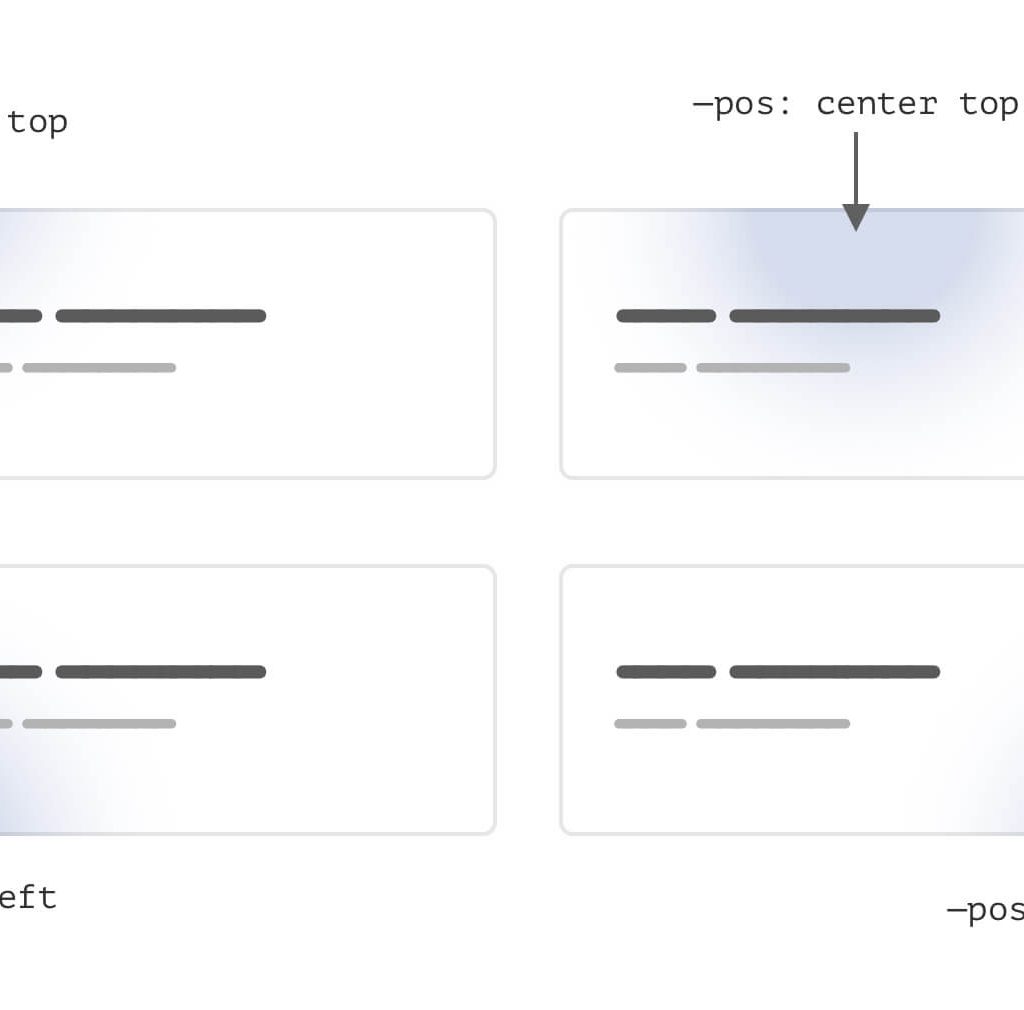
In the case of an angular gradient, using CSS variables with radial gradients really makes it much easier to adjust the position. In the following example, the position of the gradient is changed using the –pos variable.

And here you can see how you can do the same without CSS variables.
.card {
    background: radial-gradient(
        circle 200px at center top,
        rgba(64, 136, 203, 0.5),
        #f7f7f7
    );
}
Now let’s assume that we have some version of the card .card-2 and it should be in a different position. You need to write the following code:
.card-2 {
    background: radial-gradient(
        circle 200px at center top,
        rgba(64, 136, 203, 0.5),
        #f7f7f7
    );
}
Thus, the entire definition of the gradient is rewritten. Can it be done better? Definitely. Note that the only configurable value for this option is the –pos variable.
.card {
    --pos: center top;
    background: radial-gradient(
        circle 200px at var(--pos),
        rgba(64, 136, 203, 0.5),
        #f7f7f7
    );
}

.card-2 {
    --pos: left top;
}
Clip-path property.
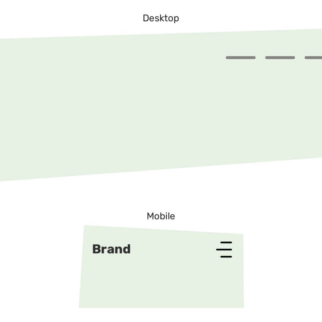
A very useful case of using the CSS variable is to use it to change the values of clip-path: polygon() when switching from desktop to mobile devices.

In the figure shown above, you need to change the position of the vertices of the polygon. Using CSS variables to do this is much easier.
.hero {
    --first: 4% 7%;
    --second: 80% 0;
    --thrid: 100% 95%;
    --fourth: 10% 100%;
    clip-path: polygon(var(--first), var(--second), var(--thrid), var(--fourth));
}

@media (min-width: 40rem) {
    .hero {
        --second: 96% 0;
        --thrid: 92% 82%;
    }
}
